Using Media Queries
In this assignment, I was tasked with writing about my experience using media queries. There are different types of computers that exist including desktops, laptops, tablets and cell phones. These different types of computers vary in size and websites must adjust to the screen size of the computer being used. A website that adjusts to the screen size of the computer being used is said to be responsive. In other words, a responsive website is one that responds, and therefore adjusts, to any given screen size.
Media queries are beneficial because they allow for a responsive web design. Media queries are used in a cascading style sheet (css) to change styling features. For example, a vertical navigation bar on a cell phone will need to be changed to a horizontal navigation bar on a desktop. The best way to approach responsive web design is to begin by styling for a small cell phone. After this is done, chrome developer tools can be used to view the website in successively larger sizes. When the styling doesn’t look good on the screen it must be changed using media queries.
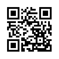
There are a couple of weaknesses of media queries. One weakness is that the screen might look slightly different depending on the browser. Also, developer tools are a guide to how the screen will look but using actual devices of varying sizes will provide a more accurate representation. To view this portfolio on a mobile device or tablet, use a qr scanner to capture the adjacent thumbnail of the qr code.
Using the Skeleton Framework
In this assignment, I was tasked with learning about the Skeleton Framework and using it to create a resume in a non-traditonal and responsive format. There were advantages and disadvantages to using the Skeleton framework. As this was my first experience using a framework, there was a bit of a learning curve. In addition to gaining an understanding of how to use html to manipulate the grid system, I also had to familiarize myself with the css in order to understand how the html was stylized. In some ways, I felt like I had less control because of the already existing code. On the other hand, as I became more familiar with the grid system and stylings, I saw the advantage of having a lot of the stylings precoded. Overall, I would say that using a framework is beneficial. It offers more flexibility than using website builders such as Wordpress and also allows for a more efficient use of time when building a website.

Using the Flexbox Framework
In this assignment, I was tasked with learning about the Flexbox Framework and following a tutorial to create a responsive website that matched the one given in the tutorial. Flexbox makes creating layouts for different-sized devices quite simple. I was surprised that I didn’t have to use the words .flex-container as a div class name. The media query for smartphones was missing, so I added it to the css file. When I went to validate the css, I got many error messages regarding the use of the word webkit. Once I deleted all appearances of the word, the css was validated. When creating columns, I would choose Flexbox over Skeleton because of its flexibility. A limitation of Skeleton is that 12 columns must always be used. This is not the case with Flexbox. I know that there is a lot more to learn about Flexbox but I thought that the tutorial served as a good introduction. I will definitely use Flexbox for future projects.

Using the Bootstrap Framework
In this assignment, I was tasked with learning about the Bootstrap Framework in order to create a responsive website for a fabricated company. Bootstrap is an excellent front-end framework. There are many benefits to using Bootstrap. It provides responsive web design and uses a mobile-first approach. It includes a variety of templates for such components as buttons, tables, and navigation. It is easy to use and manipulate and allows for quick development of web pages. Using Bootstrap’s media queries made it easier and quicker to create a responsive design. It offers far more in terms of flexibility, ease of use and precoded components than other frameworks such as Skeleton and Flexbox. There are some limitations. One limitation is that the user must first learn the predefined terminology in order to create different components. Another limitation is that the number of templates is limited. Once I familiarized myself with the Bootstrap framework, I was able to create a website more quickly than when coding everything from scratch. For this reason, I found Bootstrap to be an ideal framework to use.
Using Ionic
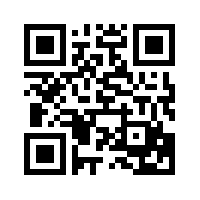
In this assignment, I was tasked with using Ionic to create a mobile app. Ionic is a hybrid mobile app framework that allows developers to build mobile apps by utilizing the framework and applying their own HTML5 and CSS3 customizations, should they choose. Whereas a native app is built for specific mobile devices, a hybrid app gives the appearance of a native app yet is built on the web. Plugins are used to access various hardware and software to achieve this goal. For users, downloading is not required with a hybrid app and because the code is not device specific it is available on more platforms. I enjoyed learning how to build a website with Ionic and see the value in using it. The benefits in using Ionic are that a developer can create an app fairly quickly and easily and make the app available across platforms. The weaknesses of using Ionic are that utilizing a framework can be restrictive to the developer and the app, while loading more quickly and being more readily available to users, will not have the same streamlined look and feel as native apps. To view the mobile app that I created on a mobile device or tablet, use a qr scanner to capture the adjacent thumbnail of the qr code.
Researching a Tech Industry
In this assignment, I was tasked with finding a company within the tech industry that I find most exciting and writing about why this is the case. This was a useful exercise. It caused me to explore the different types of tech industries that exist and think about what type of company would be a good fit for me. On the Industry web page, I write about the company that I chose and explain why I chose this company.

Using Git and Bitbucket
At the beginning of the semester, I was tasked with taking tutorials to learn how to use Git and Bitbucket. At first, I was unclear about the meaning of terms like version control system, local repository, working directory, origin, master, remote repository and the like. I also found it difficult to know which Git commands to use to navigate the terminal and which to use to make changes to my files. I learned the terminology and git commands by using Git and Bitbucket throughout the semester to create my DPR 241 Portfolio. I now have a much better understanding of the terminology. For example, I now understand what a version control system is and the purpose and benefits of using one. It allows for keeping a record of all changes and updates made to files and it also makes collaboration on a project efficient and streamlined. In addition, I feel much more comfortable and adept at using git commands on the terminal to navigate my computer system in order to locate files and make file changes and keep a record of them on my remote repository. More reflections of my experience using Git and Bitbucket over the last few months can be found on the Git web page. I am looking forward to gaining more experience using Git and a remote repository for collaborative purposes. I know that this will happen once I have opportunities to work with others on new projects.